


This is a story of how we came up with the solution for Configuration driven UI (a level below server-driven UI) in Android at Backbase. It’s not a super perfect system or not highly reactive as Jetpack compose, but it absolutely solves the use-case: to create a framework or library, where developers can create or replace view components via configurations.
Who should read?
This is about a special Android library. This solution might not be useful for all the devs who write apps every day. But I guarantee that this is an interesting problem to think and solve.
Background & Requirements
We need to deliver a library, where customers can build or configure UI components into our OOTB (out of the box) screen or collection of screens. They should also be able to do the following
- Add new screens
- Configure OOTB UI components – Create quickly and add new UI components
The above all should be possible via the configurations
Configurations?
Configurations can mean anything. It can be a simple class with properties, JSON object (local or remote). Here, we’ll be working with Kotlin DSLs
Why? they are type-safe, IDE intelli-sense support, manageable in terms of upgrading and maintaining the source and binary compatibility (how? more below). Even if we need to do it remotely (Server driven UI), we can receive a JSON object and map them to DSL.
The big picture

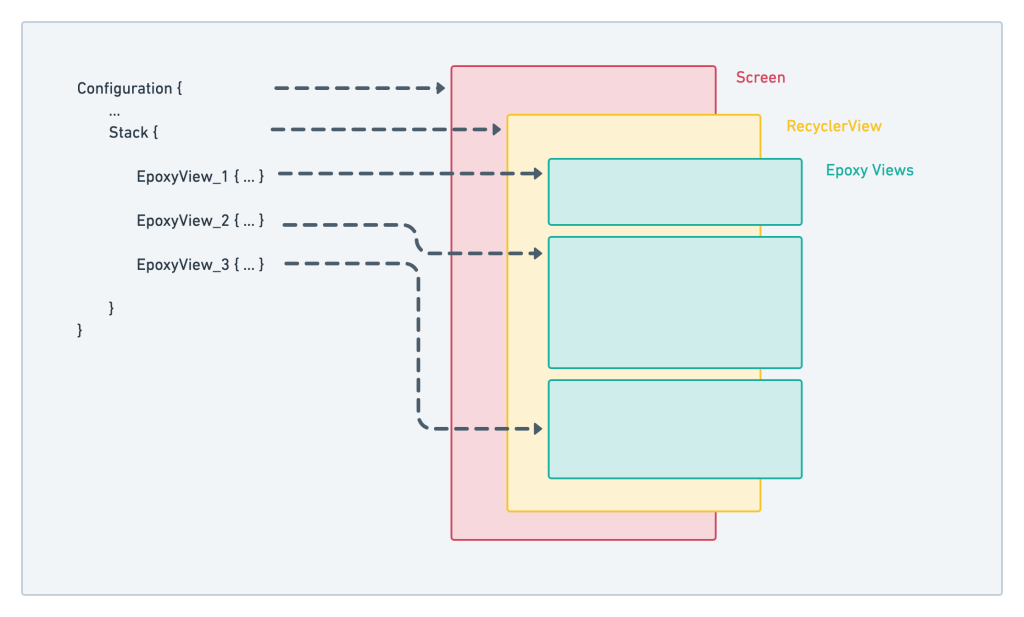
Not really that big, but here’s how this is achieved
- A Screen is nothing but a fragment and it just contains the list, here RecyclerView. I believe that this is what Airbnb app consists of – each screen is a RecyclerView with different views
- The screen gets the configuration injected via DI or Service locators such as Koin
- Using this DSL configuration, the Epoxy populates all the views in our RecyclerView
- We are also using Navigation Component here, to use the same screen with multiple instances working together to solve this (a) task
Why Epoxy?
As per the requirements, we need to provide an accelerator solution, where developers should be able to create view components quickly. Using traditional methods might burn a bit more time. Epoxy, on the other hand, manages this complexity very well with a very little learning curve and with DSLs as output, it makes the configuration seamless.
Configuration-driven UI with Epoxy

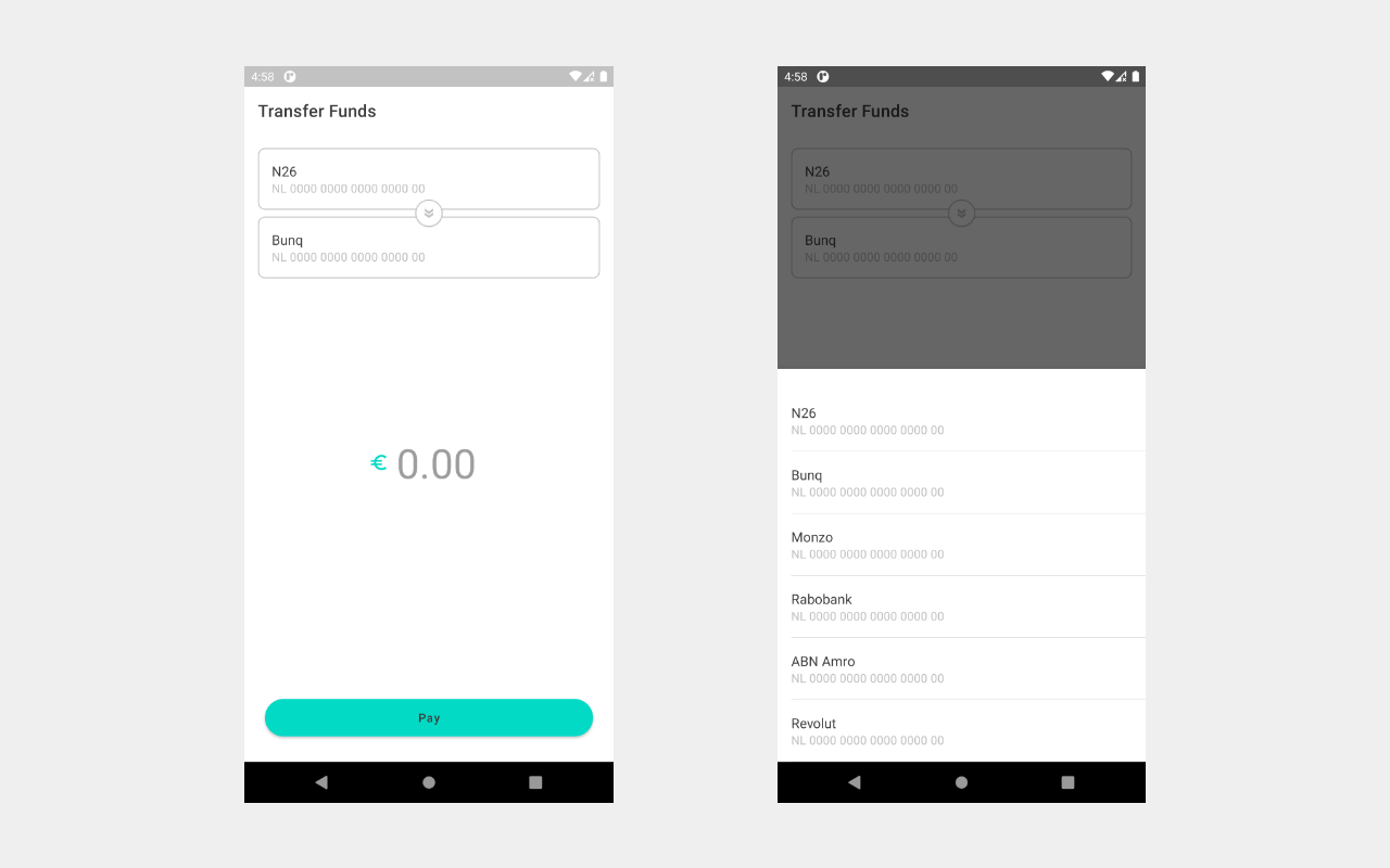
For a better explanation, why not show code? Let’s build a simple payment transfer screen, which will allow users to choose an account & a contact, enter the amount and hit pay!
In this screen, there are 2 configurable/customizable/replaceable components and room for more!
- Account selector: Allows users to select the originator account and a destination account which opens up a bottom sheet and gets the result back
- Amount view: Allows users to enter the amount
Here, the button is part of the screen for a reason, not important to know 😛
The Configuration
To better explain, let’s take a look at the actual configuration that brings out this screen to life
PaymentsConfiguration {
   // 1. navigation graph
  navGraph = R.navigation.navigation_payment
   // 2. step
  step = Step {
      title = "Transfer Funds"
      //3. layout
      layout = { fragmentManager ->
         //4. stack
          StackLayout {
              stacks = listOf(
                    //5. epoxy views
                    AccountSelectorView_().apply {
                      id(1)
                      fromAccountName("N26")
                      fromAccountNumber("NL 0000 0000 0000 0000 00")
                      toAccountName("Bunq")
                      toAccountNumber("NL 0000 0000 0000 0000 00")
                      onFromSelected { listener ->
                          AccountPicker { listener(it) }
                              .show(fragmentManager, "account-picker-from")
                      }
                      onToSelected { listener ->
                          AccountPicker { listener(it) }
                              .show(fragmentManager, "account-picker-to")
                      }
                  },
                  AmountView_().apply { id(2) }
              )
          }
      }
  }
}1. Navigation Graph: In this example, we are dealing with one screen. If there is a use-case for multiple screens, navigation graph would be a good choice (here, optional)
2. Step: This represents a screen. Multiple steps mean many screens, which can be wrapped using a list of steps (bad naming?)
3. Layout: A sealed class entity, that supports different layouts. Here, a stack of views. Purely business-case oriented (FormLayout, ListLayout etc.)
4. Stack: Here, to stack up the views takes in a list of Epoxy Views
5. Epoxy View: View components created using epoxy
AccountSelectorView uses a few interesting functional callbacks to open up a bottom-sheet dialog and get the result back
For more detailed implementation, please refer the repo.
Moving from Epoxy to Composable functions
Let’s try this interesting experiment. If you wonder why epoxy was the first choice is that the API was very stable, it provided a very quick way to create UI components with DSL wrapper – which was seamless with the whole configuration-driven UI concept.
I happened to try Jetpack Compose and it was quite promising. It was very close to the Flutter experience. But let’s check the reality on this date (Oct 2020)
- Still in
alpha - A lot of breaking changes
- Not super good with existing projects (Adding compose to existing Kotlin synthetic binding projects causes build failure, probably be fixed at the time of stable release)
- More features to come
Considering all these, epoxy is still a stable option for the above-mentioned date. But I’m curious about the migration strategy to this promising library.
What if Compose becomes the default way to create UI components in Android? (Maybe!) and it’s already a part of the Modern Android Development (MAD) marketing tag! So, this library should be able to cater or move to the new solution.
Configuration-driven UI with Jetpack Compose

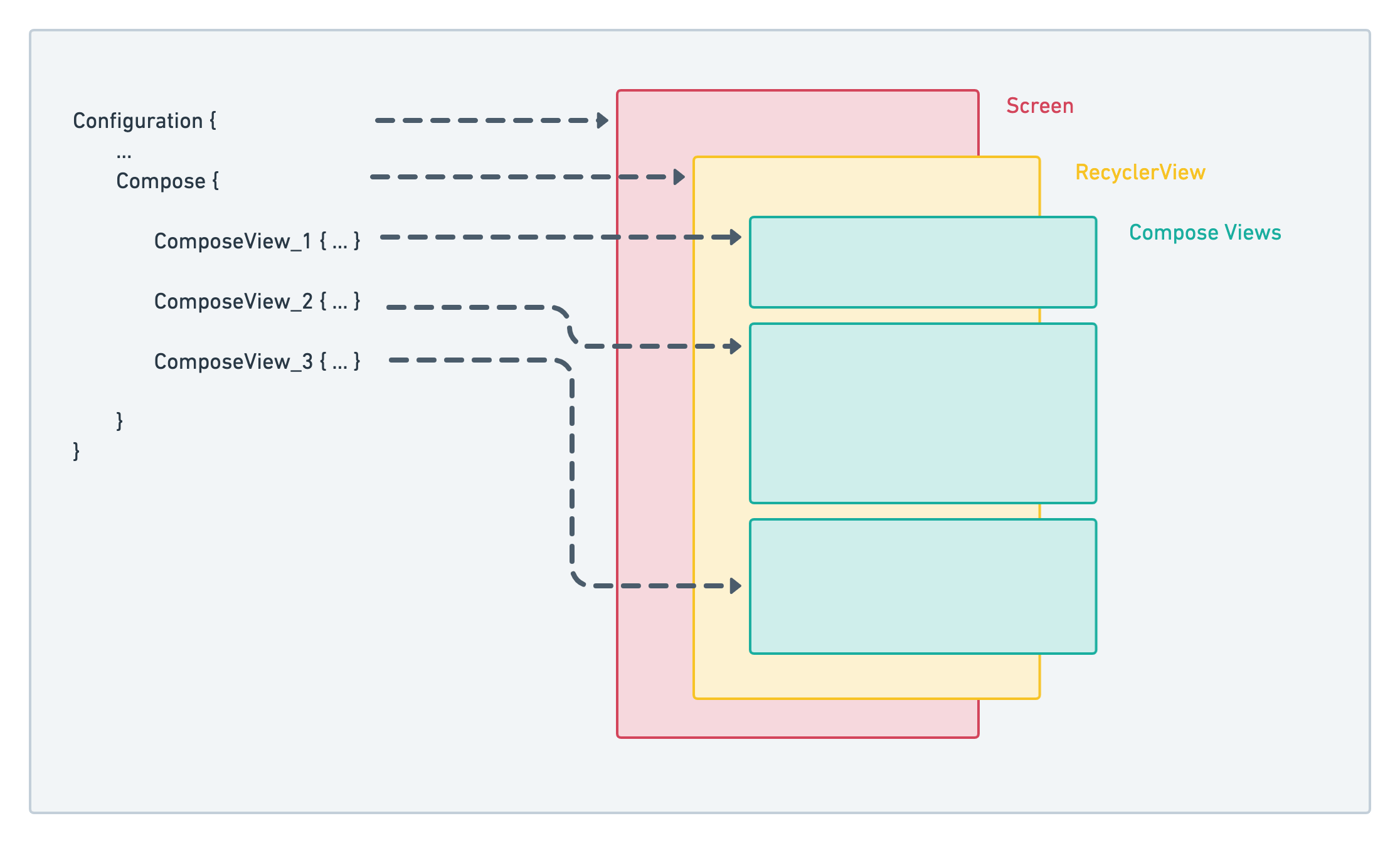
- To migrate from epoxy, our Sealed class implementation of the layout is the key. Instead of using
StackLayoutwe add a new implementation in place –ComposeLayout - Also, we replace
RecyclerViewwithComposeView
Here’s the full configuration
PaymentsConfiguration {
   navGraph = R.navigation.navigation_payment
   step = Step {
    title = "Transfer Funds"
    layout = { fragmentManager ->
        ComposeLayout {
            content = {
                Column {
                    // compose view for selecting account
                    accountSelector(
                        fromAccountName = "N26",
                        fromAccountNumber = "NL 0000 0000 0000 0000 00",
                        toAccountName = "Bunq",
                        toAccountNumber = "NL 0000 0000 0000 0000 00",
                        onFromSelected = { listener ->
                            AccountPicker { listener(it) }
                                .show(fragmentManager, "account-picker-from")
                        },
                        onToSelected = { listener ->
                            AccountPicker { listener(it) }
                                .show(fragmentManager, "account-picker-to")
                        }
                    )

                    // compose view for amount
                    amountView()
                }
            }
        }
    }
}Adding ComposeLayout to StepLayout
A New class gets to be a part of the Step layout – ComposeLayout
Note: We are creating DSLs this way – to cater for binary compatibility. You can generate DSLs that are binary-safe way + support Java interoperability using this Android Studio plugin – DSL API Generator – Plugins | JetBrains
sealed class StepLayout {

  /**
   * Created by Hari on 06/10/2020.
   * Stack Layout for epoxy lists
   *
   * Generated using DSL Builder
   * @see "https://plugins.jetbrains.com/plugin/14386-dsl-api-generator"
   *
   * @param stacks list of epoxy models
   */
  @DataApi
  class StackLayout private constructor(
   val stacks: List<EpoxyModel<*>>
  ): StepLayout() {

      /**
       * A builder for this configuration class
       *
       * Should be directly used by Java consumers.
       * Kotlin consumers should use DSL function
       */
      class Builder {

          var stacks: List<EpoxyModel<*>> = listOf()
              @JvmSynthetic set

          fun setStacks(stacks: List<EpoxyModel<*>>) =
            apply { this.stacks = stacks }

          fun build() = StackLayout(stacks)

      }
  }

  /**
   * Created by Hari on 06/10/2020.
   * Stack Layout for epoxy lists
   *
   * Generated using DSL Builder
   * @see "https://plugins.jetbrains.com/plugin/14386-dsl-api-generator"
   *
   * @param stacks list of epoxy models
   */
  @DataApi
  class ComposeLayout private constructor(
      val content: @Composable () -> Unit
  ): StepLayout() {

      /**
       * A builder for this configuration class
       *
       * Should be directly used by Java consumers.
       * Kotlin consumers should use DSL function
       */
      class Builder {

          var content: @Composable () -> Unit = {}

          fun setContent(content: @Composable () -> Unit) =
            apply { this.content = content }

          fun build() = ComposeLayout(content)
      }
  }
}

/**
* DSL to create [StackLayout]
*/
@JvmSynthetic
@Suppress("FunctionName")
fun StackLayout(block: StepLayout.StackLayout.Builder.() -> Unit) =
  StepLayout.StackLayout.Builder().apply(block).build()

/**
* DSL to create [ComposeLayout]
*/
@JvmSynthetic
@Suppress("FunctionName")
fun ComposeLayout(block: StepLayout.ComposeLayout.Builder.() -> Unit) =
StepLayout.ComposeLayout.Builder().apply(block).build()Implementation of Account selector
compose version: 1.0.0-alpha04
Refer this code on Github
@Composable
fun accountSelector(
  fromAccountName: String,
  toAccountName: String,
  fromAccountNumber: String,
  toAccountNumber: String,
  onFromSelected: (((Account) -> Unit) -> Unit)?,
  onToSelected: (((Account) -> Unit) -> Unit)?
) {
   ConstraintLayout(modifier = Modifier.padding(16.dp)) {
      val (image, cards) = createRefs()
      val fromAccount = remember {
         mutableStateOf(Account(fromAccountName, fromAccountNumber))
      }
      val toAccount = remember {
         mutableStateOf(Account(toAccountName, toAccountNumber))
      }

      Column(modifier = Modifier.constrainAs(cards) {
          top.linkTo(parent.top)
          start.linkTo(parent.start)
          end.linkTo(parent.end)
      }) {
          Card(border = BorderStroke(1.dp,
                  colorResource(id = R.color.colorPrimaryDark)),
              shape = RoundedCornerShape(8.dp),
              backgroundColor = MaterialTheme.colors.surface,
              modifier = Modifier.fillMaxWidth()
                     .fillMaxWidth().clickable(onClick = {
                  onFromSelected?.invoke { fromAccount.value = it }
              })
          ) {
              Box(modifier = Modifier.padding(16.dp)) {
                  Column {
                      Text(
                          text = fromAccount.value.accountName,
                          style = MaterialTheme.typography.subtitle1,
                      )
                      Text(
                          text = fromAccount.value.accountNumber,
                          style = MaterialTheme.typography.subtitle2,
                          color = colorResource(id = R.color.textColorSecondary)
                      )
                  }
              }
          }

          Card(
              border = BorderStroke(1.dp,
               colorResource(id = R.color.colorPrimaryDark)),
              shape = RoundedCornerShape(8.dp),
              backgroundColor = MaterialTheme.colors.surface,
              modifier = Modifier.padding(top = 8.dp).fillMaxWidth().clickable(onClick = {
                  onToSelected?.invoke { toAccount.value = it }
              })
          ) {
              Box(modifier = Modifier.padding(16.dp)) {
                  Column {
                      Text(
                          text = toAccount.value.accountName,
                          style = MaterialTheme.typography.subtitle1
                      )
                      Text(
                          text = toAccount.value.accountNumber,
                          style = MaterialTheme.typography.subtitle2,
                          color = colorResource(id = R.color.textColorSecondary)
                      )
                  }
              }
          }
      }

      Card(
          shape = CircleShape,
          border = BorderStroke(1.dp,
            colorResource(id = R.color.colorPrimaryDark)),
          modifier = Modifier.width(32.dp)
            .height(32.dp).constrainAs(image) {
                top.linkTo(parent.top)
                bottom.linkTo(parent.bottom)
                start.linkTo(parent.start)
                end.linkTo(parent.end)
          }) {
          Box(modifier = Modifier.padding(8.dp), alignment = Alignment.Center) {
              Icon(
                  asset = vectorResource(id = R.drawable.ic_baseline_double_arrow_24),
                  tint = colorResource(id = R.color.textColorSecondary)
              )
          }

      }

  }
}For full implementation of compose components and layout, please refer this compose branch
Challenges faced
We did not migrate the actual repo yet. But here are some of the challenges that I faced working on this small repo
- Compose hates Kotlin Synthetic binding? when I added all the necessary dependencies, I faced build errors around Kotlin synthetic view binding. Folks in Stackoverflow have suggested moving to
ViewBindingor simply use thefindViewByIdapproach – may be fixed in the future? - A bit of learning curve for the new state management around Compose – which was expected. My little Flutter knowledge made it better (considering that the above repo was created in 3 hours)
Final thoughts
If you have reached here, I’d appreciate your time to read this post. Configuration-driven UI might not be for everyone, it’s simply one of the business case and a very interesting problem to solve in terms of the architecture and public APIs. Hope you are taking something home 🙂
Thank you, and see you on another post!